This assignment was designed to expand my knowledge on packaging design. I was tasked with creating a brand, packaging die line, packaging design, and packaging details for a chocolate box.
Branding
The Product
Retro Confections is a variety chocolate box for those who want a visual trip down memory lane. Each chocolate will fit into a 1 inch by 1 inch square in the packaging. Each chocolate will be formed from molds in the shape of a circular record, a rectangle cassette and boom box, and oval chocolate with a microphone. The circular record will contain a caramel fill with dark chocolate and a peanut butter fill with milk chocolate. The cassette will contain dark chocolate and milk chocolate truffles. For the microphones, there will be a raspberry creme filling with dark chocolate and a vanilla cream with milk chocolate, and the boom box will have a coconut filling with milk chocolate.
Brand Concept
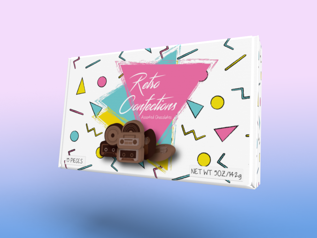
Retro Confections will first be distributed to nostalgia based stores such as Lunch Box, Urban Outfitters, and Ragstock. While the chocolates are very simple, the packaging and shapes of the chocolates themselves will be the selling feature. The package will be eye catching and perfect for gifting. The look is that of 80s and 90s color profiles and shapes. The main demographic will be both males and females ages 25-40 years, or anyone who has a taste for the decades of fun. The carton will be rectangular and have a lid that opens and closes. The rectangle shape will allow Retro Confections to sit on the shelves nicely and fit into shipping boxes without wasting space.
Colors
Fonts
The Logo
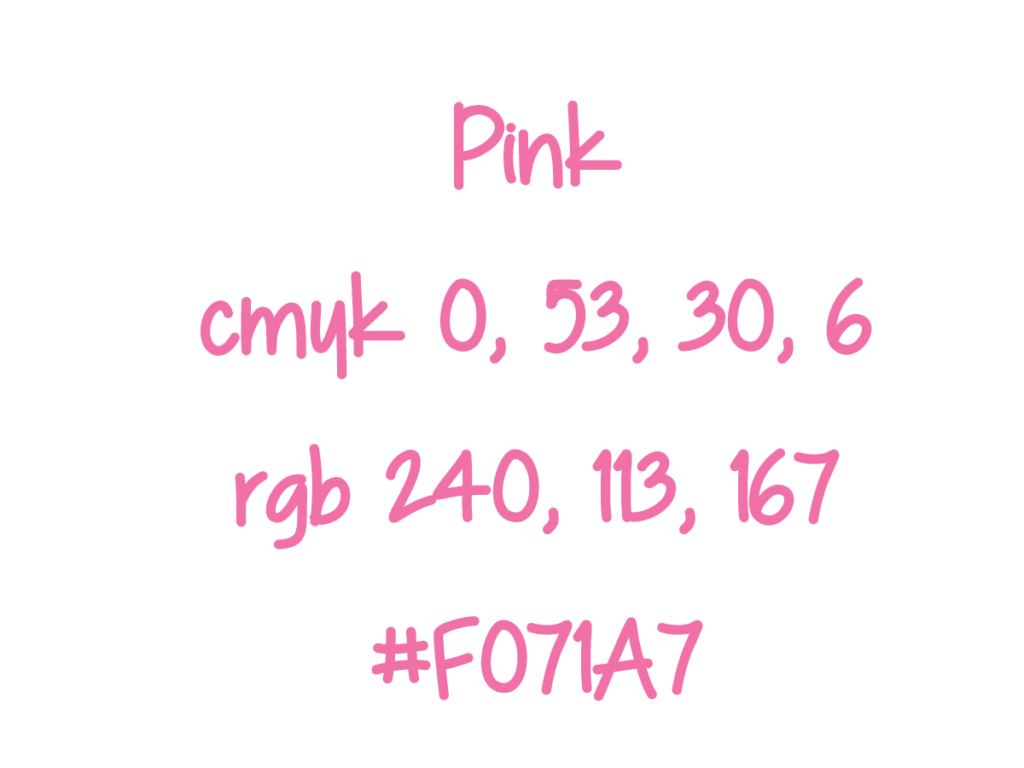
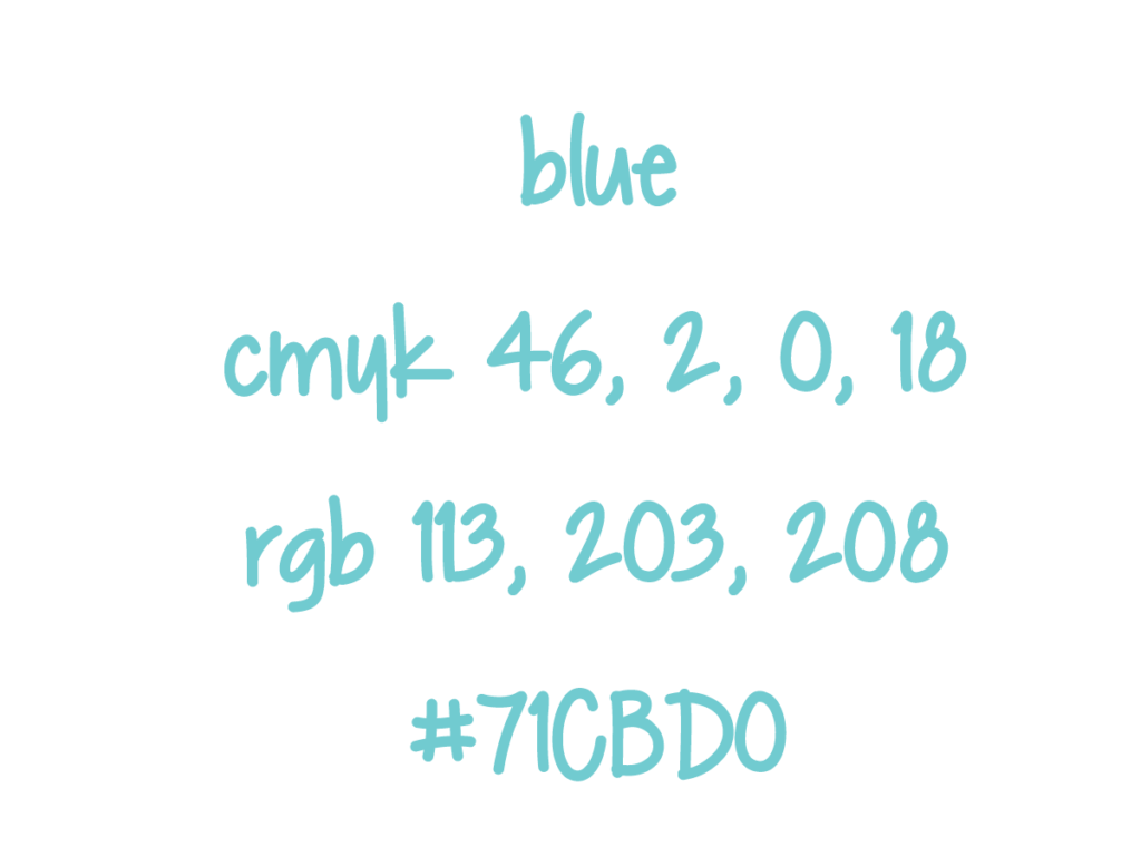
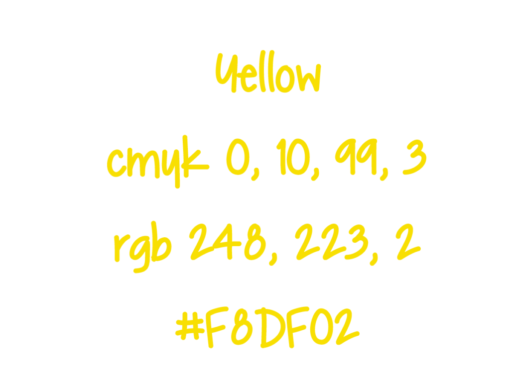
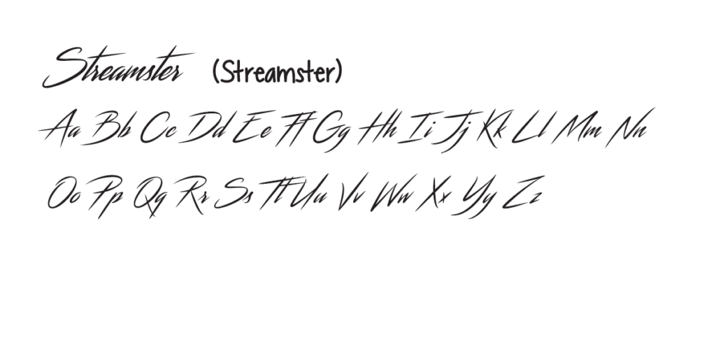
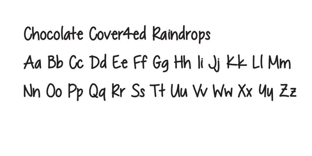
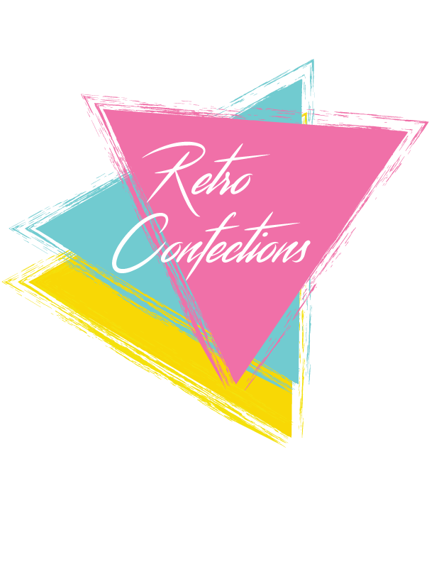
I wanted this to be a fun and brite concept. Chocolate is supposed to be fun! I chose three fun colors that reminded me of the 80s and 90s and found a font that looked like it was from those decades as well. The font is used is ‘Streamster’.
I made the main shape of the logo as triangles, since that shape was used in the 80s and 90s. I added a stroke to the triangles to give the logo some texture.
Creating the Die Line
After coming up with the concept and branding, it was time to choose a box for my chocolates. I decided on a rectangle box with a flip lid. It was best to keep the box simple to keep costs low and for easy merchandising in stores.
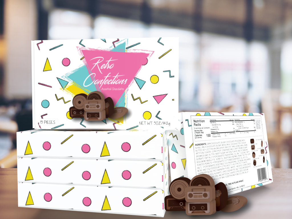
Once I chose a die line for my box, I created a pattern in Illustrator to decorate the box. I used triangles, circles, lines, and zig zags to create the typical 80s/90s look.
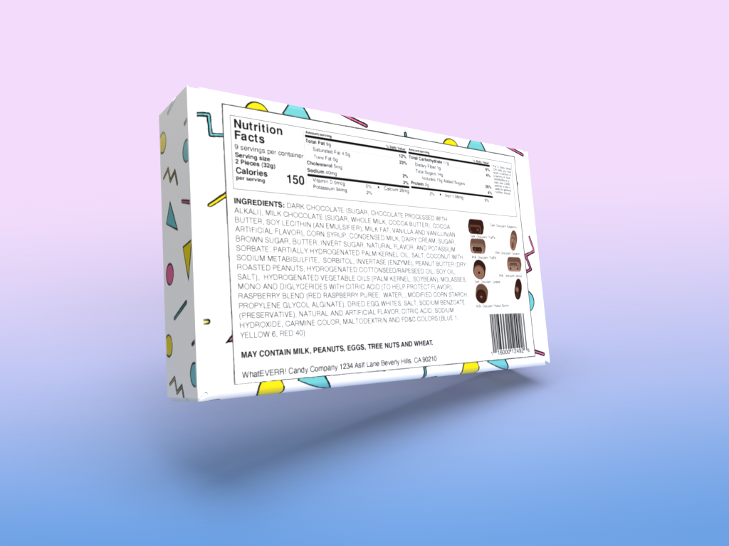
I added my nutritional facts, ingredients, and barcode to the back of the box. Once everything was in place, I created each of my chocolates since they had unique shapes and molds. I even arranged them in the tray of the box.