My first encounter with Pawsitism, Inc. was for school credit. The class was dedicated to giving us real life experience working with non-profit organizations. My team worked to make Pawsitism, Inc. a better logo and branding guide along with some other marketing tools
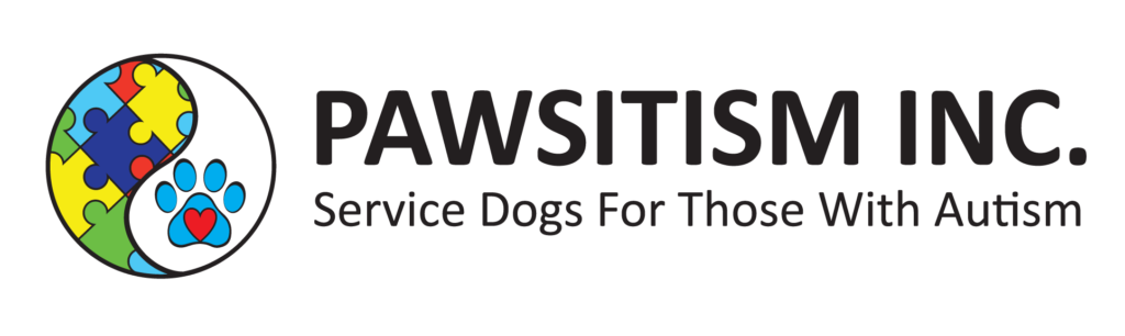
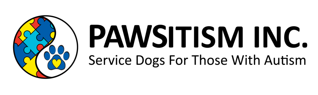
Old vs New Logo
As a team, we decided that the logo didn’t need to be completely redone, just some modification. We changed the colors and the placement of the colors for the puzzle pieces. We also changed the light blue to dark blue in the paw. Rebekah had mentioned that their organization got confused with another with a similar name of Pawtism. To solve this issue, we decided that manipulating the typography would help make them stand out. We enlarged the P, A, W, S, in the beginning of the name to make PAWS stand out.
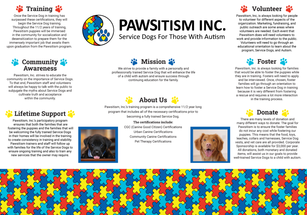
With a new logo, we were able to design the service vests for their current dogs and their newest recruit. We made typography designs for their Assistance Dogs, Service Dogs, and Puppy In Training. We also created a layout for their display board that they could use at events.