Good Eats Project – KO Catering

Objective

In this project, a culinary student (Kristi Olds) “hired” myself and my colleague, Nic Godsay, to create a logo and branding concept for her catering business K.O. Catering. We scheduled a meeting and spoke with Kristi about what she was expecting in terms of look and feel for her brand. After going through the discovery process, Nic and I decided that we would each create our own branding and present them to Kristi in our next meeting.

The Beginning

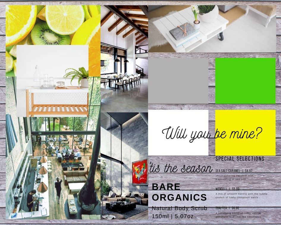
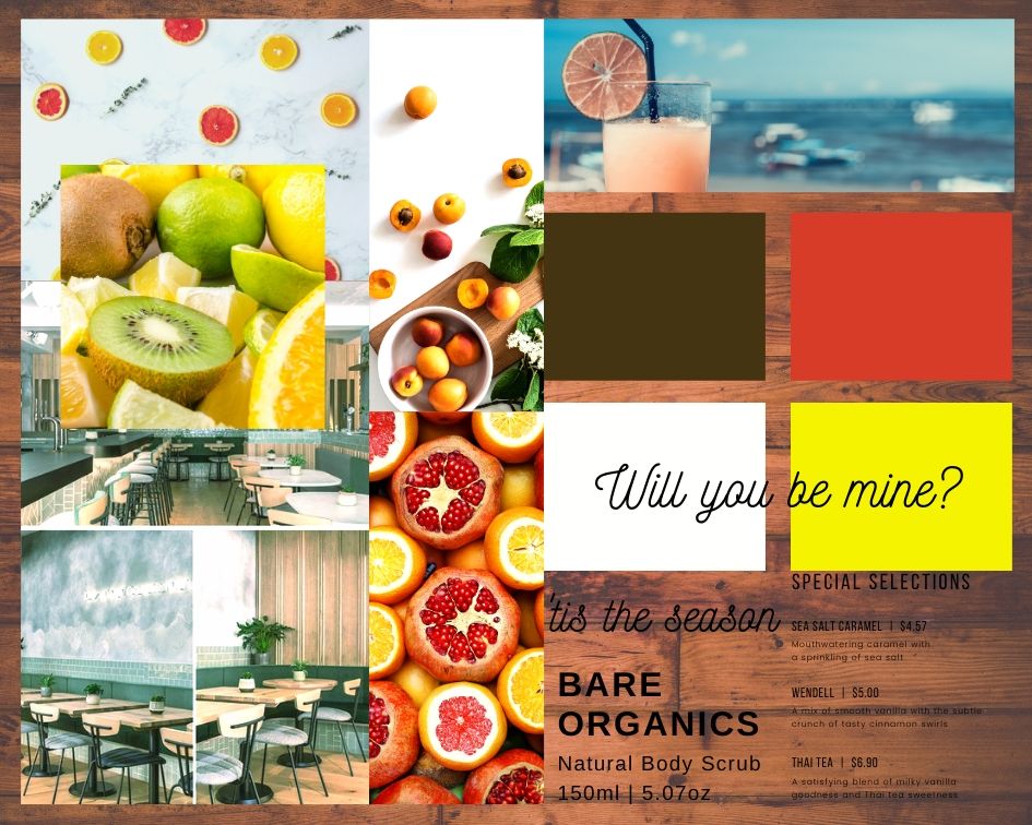
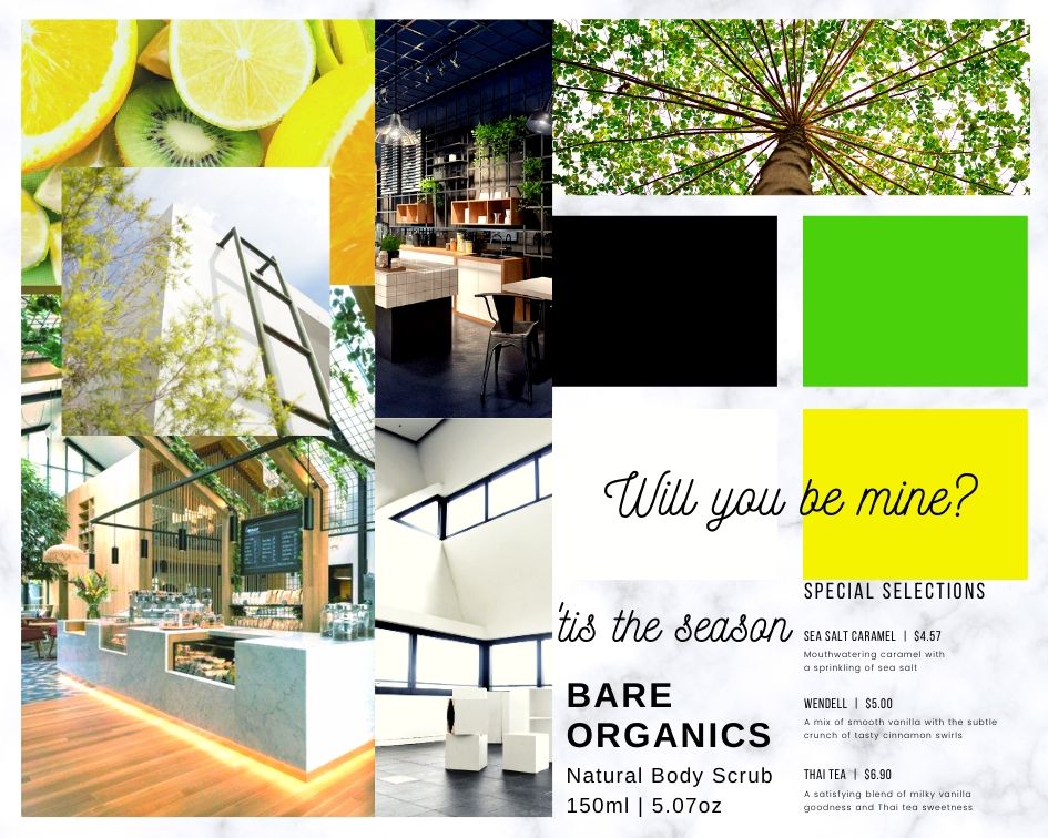
To start, I looked at the words that Kristi used to describe what her brand would look and feel like. Originally, she was thinking of a color pallet of black and neon colors. Kristi also wanted a fresh feel to her brand and somehow incorporate the lake. To see if I understood her vision correctly, I created mood boards for each aspect she was looking for.

Mood Board 1
Mood Board 2

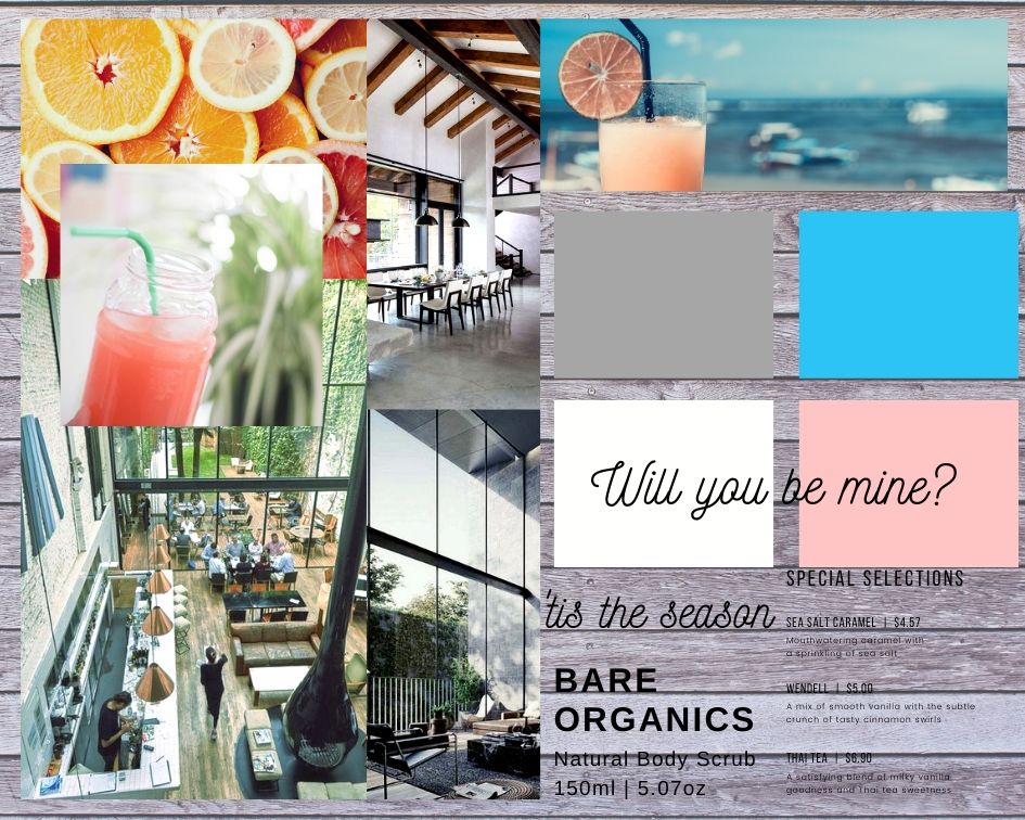
Mood Board 3
Mood Board 4

I originally sent her the first thee boards to see if one of them spoke to her. After seeing the picture of the pink drink by water in the third board, Kristi declared that in that one picture was her brand concept. I then went back to create another mood board centered around that single picture to create the color pallet and feel for Kristi’s catering business.

From Ideas to Paper

After the mood boards, I sat down and sketched a few designs. Kristi already had an idea for the logo by having a K and O and having Catering cut across the middle of the two letters. So I originally stuck with that for a couple of sketches. I then branched off into other ideas taking inspiration from the mood board.

I then brought my favorite sketches into Illustrator to digitally create.

In our second meeting with Kristi, Nic and I presented what we had so far. We talked about the colors and font styles that Nic and myself chose for our logos. There was also communication on if we were going in the right direction with our designs.

We collectively decided that elements from both Nic and mine’s designs would be molded together to create Kristi’s vision for her brand. From there Nic and I worked together to finalize the logo and create the marketing tools that Kristi requested.

The Final Product

Design

The overall design was a combination of both Nic and myself. We used the font that Nic found that Kristi liked the most. We added the fruit slice to add the fresh element that Kristi wanted her brand to represent.


Marketing

Kristi’s vision for K.O. Catering was to be a part of the community in Port Washington, WI. She even showed us the demographics of the area and we collectively found that people from ages 30-50 years old were living there. Knowing this, we designed the logo to be easy to read for all ages.

 

Colors

The colors were the final decision of Kristi. She wanted fresh colors that tied in the lake that was nearby the building she had her eye on. We went with a coral pink and a blue to give a coastal feel.

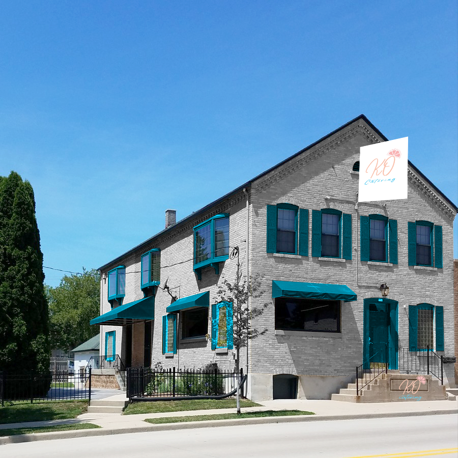
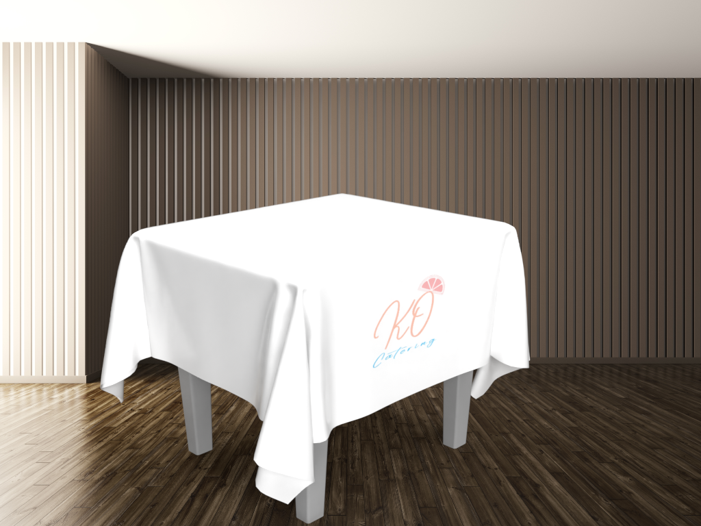
Marketing and Mockups

Business Card

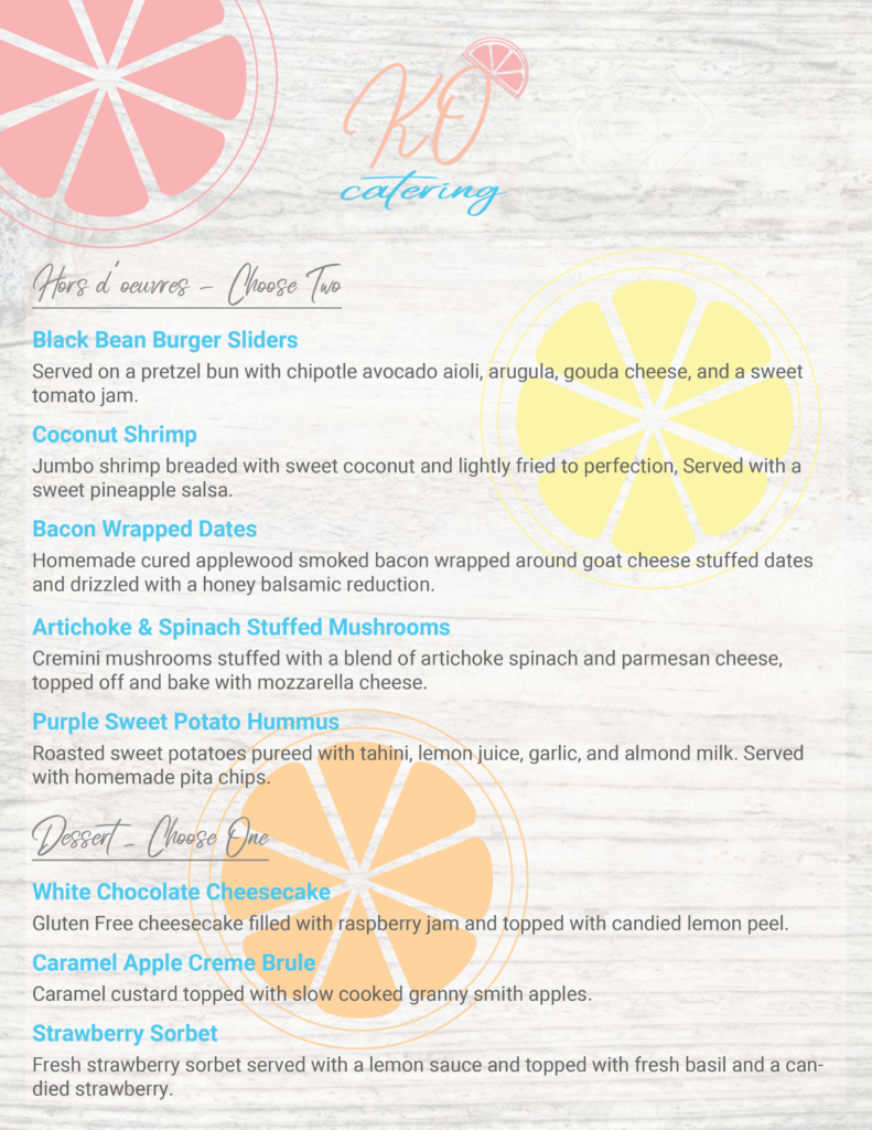
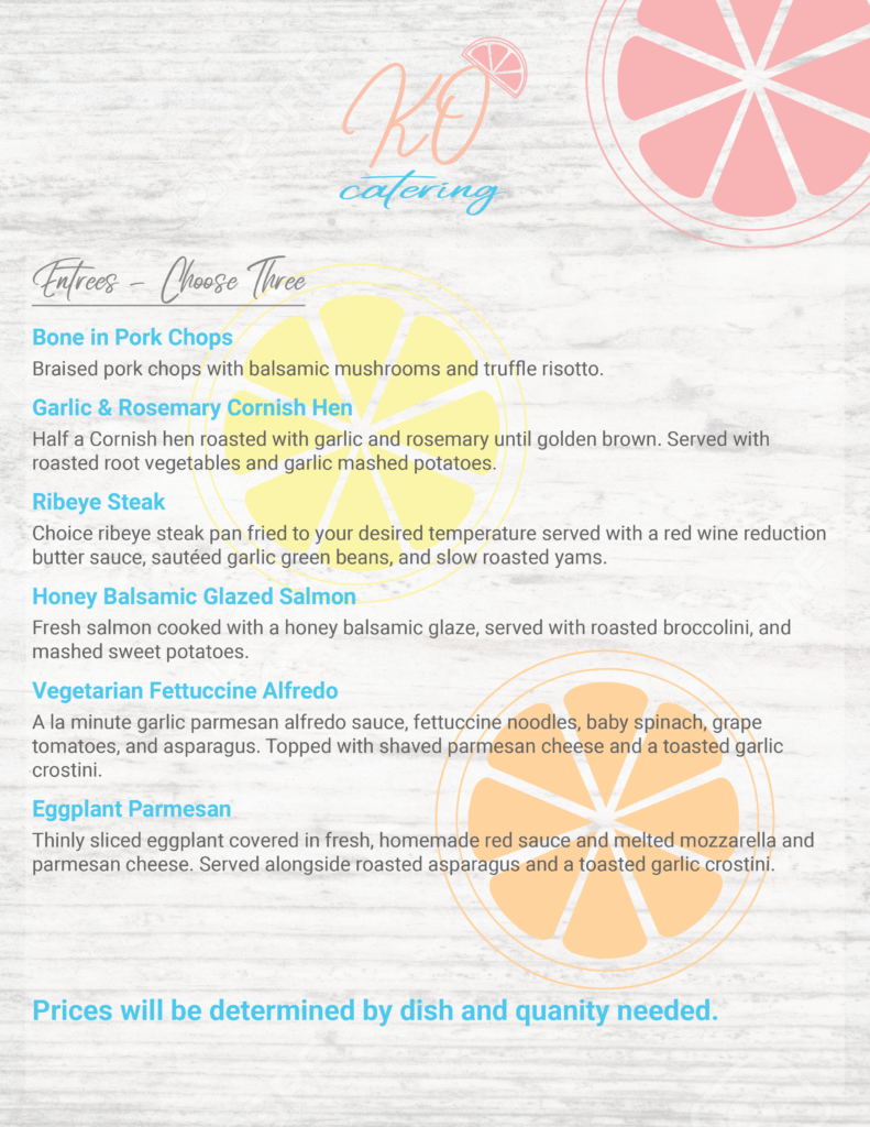
Menu

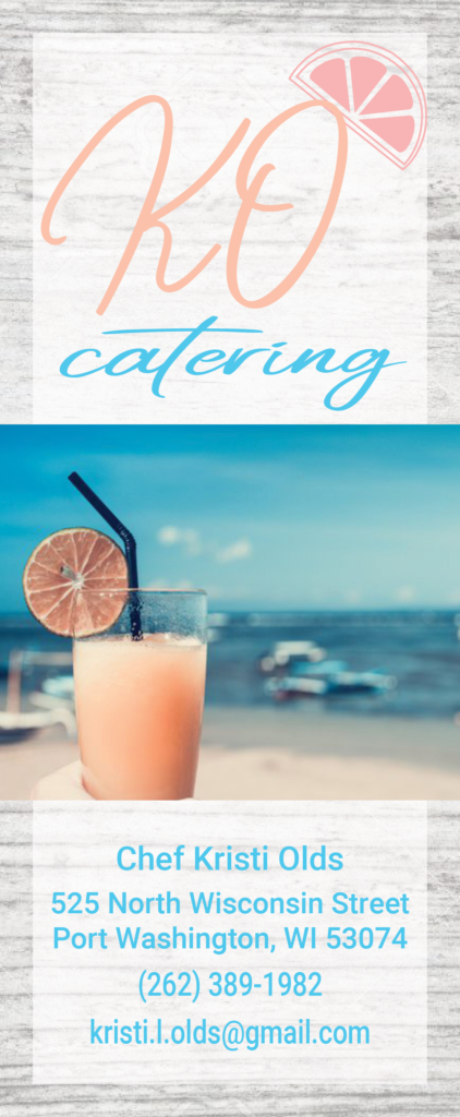
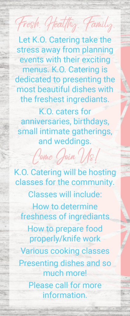
Rack Card

Back To Top